
See also: Part 1, Part 2 and Part 3.
This article will assume you know at least something about HTML, and a bit about CSS – even if it is just the basic stuff like the simple code shown in the example in part 3:
<html>
  <head>
    <title>My First Home Page</title>
  </head>
  <body>
    <p>Welcome to my home page!</p>
    <p>Check out my other pages:</p>
    <ul>
      <li><a href="about.html">About Me</a></li>
      <li><a href="mydog.html">My Dog</a></li>
      <li><a href="poetry.html">My Poems</a></li>
    </ul>
  </body>
</html>
That makes this:

But, with a bit of additional CSS styles, we can colorize and do other effects.
<html>
  <head>
     <title>My First Home Page</title>
   </head>
   <body>
     <p style="color: red">Welcome to my home page!</p>
     <p style="color: green">Check out my other pages:</p>
     <ul style="background: black">
       <li><a href="about.html">About Me</a></li>
       <li><a href="mydog.html">My Dog</a></li>
       <li><a href="poetry.html">My Poems</a></li>
     </ul>
   </body>
</html>
That might look like this:

Here is an excellent tutorial on CSS:
I was visiting this site a few weeks ago looking up some CSS things and I ran across a style sheet they had created which let you easily create navigation bars, menus, and responsive (scales to phone or desktop screens) websites. It was called w3.css:
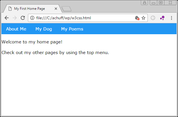
By linking in that style sheet, and tagging items in your web page, you can turn a boring, bland HTML page in to something more modern. By just including the “w3.css” style sheet in your page, and adding a “class” parameter to an unordered list, you suddenly have a modern navigation menubar:
<html>
  <head>
    <title>My First Home Page</title>
    <link rel="stylesheet" href="http://www.w3schools.com/lib/w3.css">
  </head>
  <body>
    <ul class="w3-navbar w3-blue">
      <li><a href="about.html">About Me</a></li>
      <li><a href="mydog.html">My Dog</a></li>
      <li><a href="poetry.html">My Poems</a></li>
    </ul>
    <p>Welcome to my home page!</p>
    <p>Check out my other pages by using the top menu.</p>
  </body>
</html>
Since I wanted the menu bar to be at the top, I moved that line to the top. It looks like this:
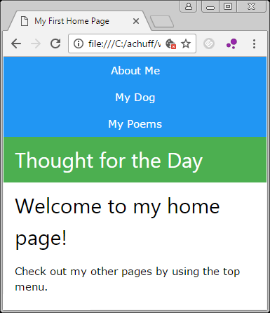
And by adding a few more “class” tags, you can create horizontal side menus and a bunch more. For example, you can easily create a page layout, such as a navigation bar, left box, and main content area:
<html>
  <head>
    <title>My First Home Page</title>
  <link rel="stylesheet" href="http://www.w3schools.com/lib/w3.css">
  </head>
  <body>
    <ul class="w3-navbar w3-blue">
      <li><a href="about.html">About Me</a></li>
      <li><a href="mydog.html">My Dog</a></li>
      <li><a href="poetry.html">My Poems</a></li>
    </ul>
    <div class="w3-row">
      <div class="w3-third w3-container w3-green">
        <h2>Thought for the Day</h2>
      </div>
      <div class="w3-twothird w3-container">
        <h2>Welcome to my home page!</h2>
        <p>Check out my other pages by using the top menu.</p>
      </div>
    </div>
  </body>
</html>
…and suddenly you have this:

And, this design automatically becomes responsive, and resizes for phone screens:
How cool is that?
I just had to share.
Explore the w3.css tutorial site for many examples. There are a ton of fun things you can do with very little work these days.
Have fun!